

- Typographic Character as Form -
Overview
The anatomy of a typographic character is categorized by the various elements that make up its shape, like its weight, height, thickness, and so on. This project focuses on the exploration of typographic characters and how their structures can be combined with each other to create unique forms and compositions.
Process
This project involved multiple stages of iterations in order to determine the best character pairings. I began by observing a variety of serif and san serif typefaces and their structures to determine what would make for interesting combinations when paired together. The two typefaces I decided to move forward with for this project were Proxima Nova (san serif) and Bodoni URW (serif). These two typefaces were chosen given the contrasting features between them and the variety of styles that each offer.
Typeface/Font Exploration

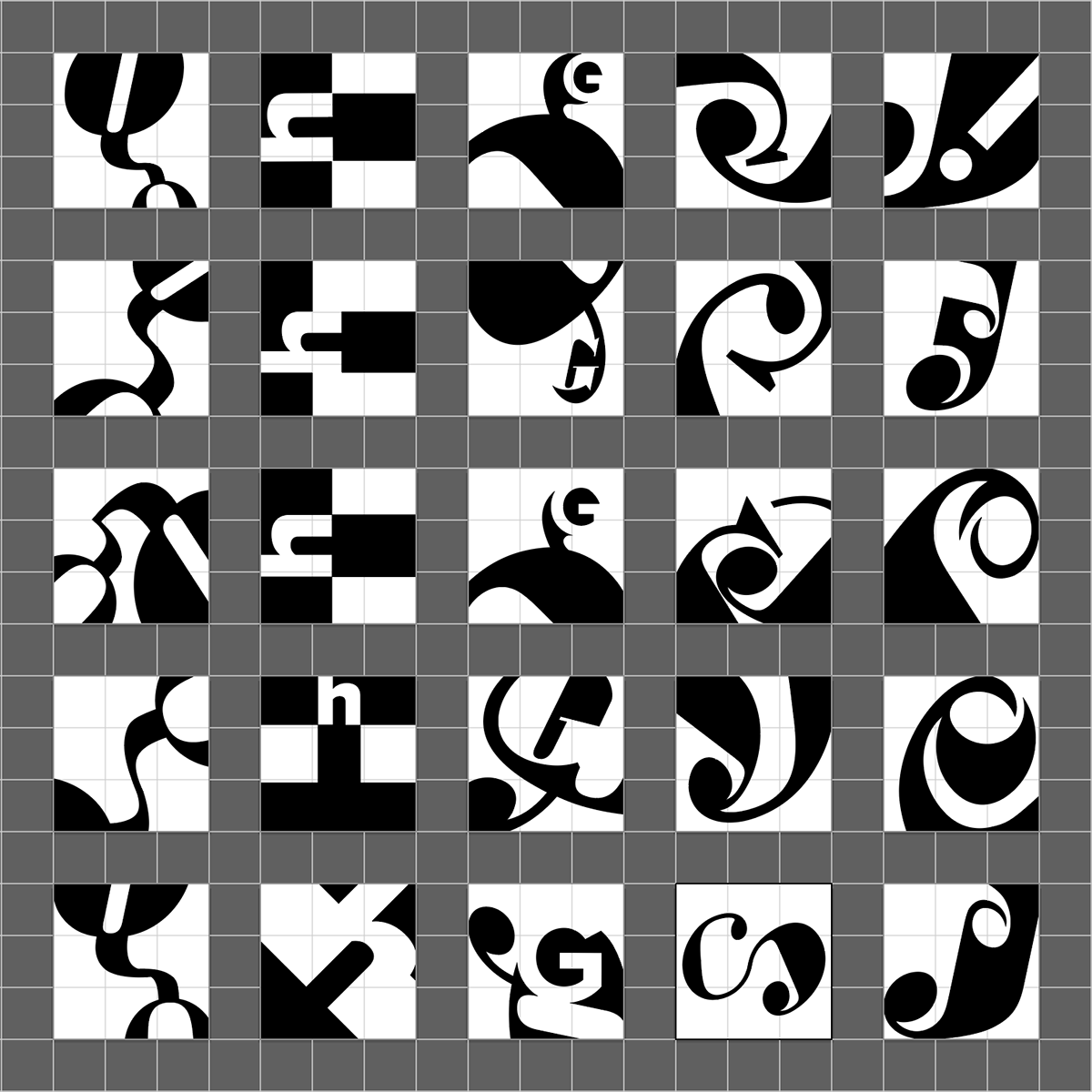
Five letterforms were selected within each typeface based on their structure and anatomy. Components that were considered when choosing the final letterforms were the unique orientation and sizing of their stem, terminal, ear, and other anatomic parts. With the five letterforms, multiple compositions were designed to further explore the forms that can be constructed when combining the letterforms together.


Top five compositions from each letterform set (25 total selections).


Outcome
Out of the many iterations created throughout the design process, the final five compositions were selected as they reflect the purpose of this project: to create unique compositions through the pairing of letterforms.


